In [34]:
from dsc80_utils import *

# For the JSON evaluation example.
def err():
    raise ValueError('i just deleted all your files lol 😂')
Midterm Exam 📝
Next week during the normal lecture slot (or TTC).
- 80 minutes long. If you arrive late, you will get less time to complete your exam!
- Pen and paper only. No calculators, phones, or watches allowed.
- You are allowed to bring one double-sided 8.5" x 11" sheet of handwritten notes.
- No reference sheet given, unlike DSC 10!
- Covers Lectures 1-9 and all related assignments.
- To review problems from old exams, go to practice.dsc80.com.
- Also look at the Resources tab on the course website.
Agenda 📆
- Introduction to HTTP.
- Making HTTP requests.
- Data formats.
- APIs and web scraping.
- Midterm review.
Introduction to HTTP

Data sources
Often, the data you need doesn't exist in "clean"
.csvfiles.Solution: Collect your own data!
- Design and administer your own survey or run an experiment.
- Find related data on the internet.
- The internet contains massive amounts of historical record; for most questions you can think of, the answer exists somewhere on the internet.
Collecting data from the internet
There are two ways to programmatically access data on the internet:
- through an API.
- by scraping.
We will discuss the differences between both approaches, but for now, the important part is that they both use HTTP.
HTTP
HTTP stands for Hypertext Transfer Protocol.
- It was developed in 1989 by Tim Berners-Lee (and friends).
It is a request-response protocol.
- Protocol = set of rules.
HTTP allows...
- computers to talk to each other over a network.
- devices to fetch data from "web servers."
The "S" in HTTPS stands for "secure".
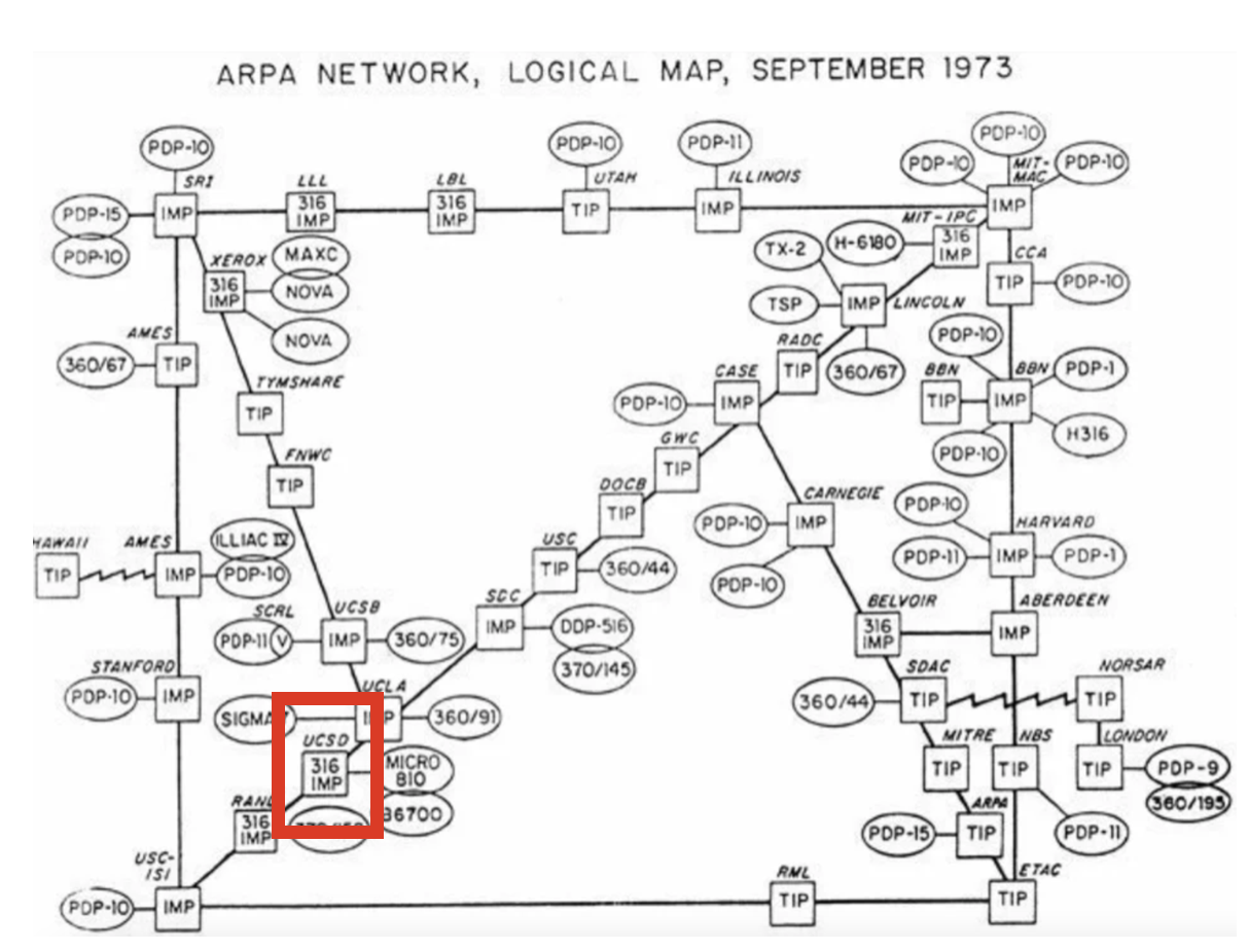
UCSD was a node in ARPANET, the predecessor to the modern internet (source).
The request-response model
HTTP follows the request-response model.
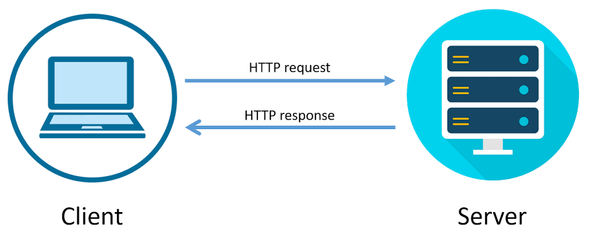
A request is made by the client.
A response is returned by the server.
Example: YouTube search 🎥.
- Consider the following URL: https://www.youtube.com/results?search_query=apple+vision+pro.
- Your web browser, a client, makes an HTTP request with a search query.
- The server, YouTube, is a computer that is sitting somewhere else.
- The server returns a response that contains the search results.
- Note: ?search_query=apple+vision+pro is called a "query string."
Request methods
The request methods you will use most often are GET and POST; see Mozilla's web docs for a detailed list of request methods.
GETis used to request data from a specified resource.POSTis used to send data to the server.- For example, uploading a photo to Instagram or entering credit card information on Amazon.
Example GET request
Below is an example GET HTTP request made by a browser when accessing datascience.ucsd.edu.
GET / HTTP/1.1
Connection: keep-alive
Host: datascience.ucsd.edu
User-Agent: Mozilla/5.0 (Macintosh; Intel Mac OS X 10_15_7) AppleWebKit/537.36 (KHTML, like Gecko) Chrome/121.0.0.0 Safari/537.36
sec-ch-ua: "Chromium";v="121", "Not A(Brand";v="99"
sec-ch-ua-platform: "macOS"
The first line (
GET / HTTP/1.1) is called the "request line", and the lines afterwards are called "header fields". Header fields contain metadata.We could also provide a "body" after the header fields.
To see HTTP requests in Google Chrome, follow these steps.
Example GET response
The response below was generated by executing the request on the previous slide.
HTTP/1.1 200 OK
Date: Sun, 04 Feb 2024 17:35:01 GMT
Server: Apache
X-Powered-By: PHP/7.4.33
Link: <https://datascience.ucsd.edu/wp-json/>; rel="https://api.w.org/"
Link: <https://datascience.ucsd.edu/wp-json/wp/v2/pages/113>; rel="alternate"; type="application/json"
...
<html lang="en-US">
<head>
<meta charset="UTF-8">
<meta name="viewport" content="width=device-width, initial-scale=1.0"/>
<meta http-equiv="X-UA-Compatible" content="IE=edge">
<link rel="profile" href="https://gmpg.org/xfn/11"/>
<title>Halıcıoğlu Data Science Institute –UC San Diego</title>
<script>
...
Consequences of the request-response model
When a request is sent to view content on a webpage, the server must:
- process your request (i.e. prepare data for the response).
- send content back to the client in its response.
Remember, servers are computers.
- Someone has to pay to keep these computers running.
- This means that every time you access a website, someone has to pay.
Making HTTP requests
Making HTTP requests
There are (at least) two ways to make HTTP requests outside of a browser:
From the command line, with
curl.From Python, with the
requestspackage.
Making HTTP requests using requests
requestsis a Python module that allows you to use Python to interact with the internet!- There are other packages that work similarly (e.g.
urllib), butrequestsis arguably the easiest to use.
In [1]:
import requests
Example: GET requests via requests
For instance, let's access the source code of the UCSD homepage, https://ucsd.edu.
In [2]:
res = requests.get('https://ucsd.edu')
res is now a Response object.
In [3]:
res
Out[3]:
<Response [200]>
The text attribute of res is a string that containing the entire response.
In [4]:
type(res.text)
Out[4]:
str
In [5]:
len(res.text)
Out[5]:
63555
In [6]:
print(res.text[:1000])
<!DOCTYPE html>
<html lang="en">
  <head>


    <meta charset="utf-8"/>
    <meta content="IE=edge" http-equiv="X-UA-Compatible"/>
    <meta content="width=device-width, initial-scale=1" name="viewport"/>
    <title>University of California San Diego</title>
    <meta content="University of California, San Diego" name="ORGANIZATION"/>
    <meta content="index,follow,noarchive" name="robots"/>
    <meta content="UCSD" name="SITE"/>
    <meta content="University of California San Diego" name="PAGETITLE"/>
    <meta content="The University California San Diego is one of the world's leading public research universities, located in beautiful La Jolla, California" name="DESCRIPTION"/>
    <link href="favicon.ico" rel="icon"/>


<!-- Site-specific CSS files -->

  <link href="https://www.ucsd.edu/_resources/css/vendor/brix_sans.css" rel="stylesheet" type="text/css"/>
  <link href="https://www.ucsd.edu/_resources/css/vendor/refrigerator_deluxe.css" rel="stylesheet"
Example: POST requests via requests
The following call to requests.post makes a post request to https://httpbin.org/post, with a 'name' parameter of 'King Triton'.
In [7]:
post_res = requests.post('https://httpbin.org/post',
                         data={'name': 'King Triton'})
post_res
Out[7]:
<Response [200]>
In [8]:
post_res.text
Out[8]:
'{\n "args": {}, \n "data": "", \n "files": {}, \n "form": {\n "name": "King Triton"\n }, \n "headers": {\n "Accept": "*/*", \n "Accept-Encoding": "gzip, deflate, br, zstd", \n "Content-Length": "16", \n "Content-Type": "application/x-www-form-urlencoded", \n "Host": "httpbin.org", \n "User-Agent": "python-requests/2.32.3", \n "X-Amzn-Trace-Id": "Root=1-6810a317-2b8e520d6f893a5068f7dcc8"\n }, \n "json": null, \n "origin": "70.95.2.196", \n "url": "https://httpbin.org/post"\n}\n'
In [9]:
# More on this shortly!
post_res.json()
Out[9]:
{'args': {},
 'data': '',
 'files': {},
 'form': {'name': 'King Triton'},
 'headers': {'Accept': '*/*',
  'Accept-Encoding': 'gzip, deflate, br, zstd',
  'Content-Length': '16',
  'Content-Type': 'application/x-www-form-urlencoded',
  'Host': 'httpbin.org',
  'User-Agent': 'python-requests/2.32.3',
  'X-Amzn-Trace-Id': 'Root=1-6810a317-2b8e520d6f893a5068f7dcc8'},
 'json': None,
 'origin': '70.95.2.196',
 'url': 'https://httpbin.org/post'}
What happens when we try and make a POST request somewhere where we're unable to?
In [10]:
yt_res = requests.post('https://youtube.com',
                       data={'name': 'King Triton'})
yt_res
Out[10]:
<Response [400]>
In [11]:
yt_res.text
Out[11]:
'<html lang="en" dir="ltr"><head><title>Oops</title><style nonce="e_FyxfUpvsAZjGi6TUpX3A">html{font-family:Roboto,Arial,sans-serif;font-size:14px}body{background-color:#f9f9f9;margin:0}#content{max-width:440px;margin:128px auto}svg{display:block;pointer-events:none}#monkey{width:280px;margin:0 auto}h1,p{text-align:center;margin:0;color:#131313}h1{padding:24px 0 8px;font-size:24px;font-weight:400}p{line-height:21px}sentinel{}</style><link rel="shortcut icon" href="https://www.youtube.com/img/favicon.ico" type="image/x-icon"><link rel="icon" href="https://www.youtube.com/img/favicon_32.png" sizes="32x32"><link rel="icon" href="https://www.youtube.com/img/favicon_48.png" sizes="48x48"><link rel="icon" href="https://www.youtube.com/img/favicon_96.png" sizes="96x96"><link rel="icon" href="https://www.youtube.com/img/favicon_144.png" sizes="144x144"></head><body><div id="content"><h1>Something went wrong</h1><p><svg id="monkey" viewBox="0 0 490 525"><path fill="#6A1B9A" d="M325 85c1 12-1 25-5 38-8 29-31 52-60 61-26 8-54 14-81 18-37 6-26-37-38-72l-4-4c0-17-9-33 4-37l33-4c9-2 9-21 11-30 1-7 3-14 5-21 8-28 40-42 68-29 18 9 36 19 50 32 13 11 16 31 17 48z"/><path fill="none" stroke="#6A1B9A" stroke-width="24" stroke-linecap="round" stroke-miterlimit="10" d="M431 232c3 15 21 19 34 11 15-9 14-30 5-43-12-17-38-25-59-10-23 18-27 53-21 97s1 92-63 108"/><path fill="#6A1B9A" d="M284 158c35 40 63 85 86 133 24 52-6 113-62 123-2 0-4 1-6 1-53 9-101-33-101-87V188l83-30z"/><path fill="#F7CB4D" d="M95 152c-3-24 13-57 46-64l27-5c9-2 16-19 17-28l3-15 20-3c44 14 42 55 18 69 22 0 39 26 32 53-5 18-20 32-39 36-13 3-26 5-40 8-50 8-80-14-84-51z"/><path fill="#6A1B9A" d="M367 392c-21 18-77 70-25 119h-61c-27-29-32-69 1-111l85-8z"/><path fill="#6A1B9A" d="M289 399c-21 18-84 62-32 111h-61c-37-34-5-104 43-134l50 23z"/><path fill="#EDB526" d="M185 56l3-15 20-3c25 8 35 25 35 41-12-18-49-29-58-23z"/><path fill="#E62117" d="M190 34c8-28 40-42 68-29 18 9 36 19 50 32 10 9 14 23 16 37L187 46l3-12z"/><path fill="#8E24AA" d="M292 168c0 0 0 201 0 241s20 98 91 85l-16-54c-22 12-31-17-31-37 0-20 0-108 0-137S325 200 292 168z"/><path fill="#F7CB4D" d="M284 79c11-9 23-17 35-23 25-12 54 7 59 38v1c4 27-13 51-36 53-12 1-25 1-37 0-22-1-39-27-32-52v-1c2-6 6-12 11-16z"/><path fill="#6A1B9A" d="M201 203s0 84-95 140l22 42s67-25 89-86-16-96-16-96z"/><path fill="#BE2117" d="M224 54l-67-14c-10-2-13-15-5-21s18-6 26 0l46 35z"/><circle fill="#4A148C" cx="129" cy="161" r="12"/><circle fill="#4A148C" cx="212" cy="83" r="7"/><circle fill="#4A148C" cx="189" cy="79" r="7"/><path fill="#F7CB4D" d="M383 493c11-3 19-8 25-13 7-10 4-16-5-20 8-9 2-22-8-18 1-1 1-2 1-3 3-9-9-15-15-8-3 4-8 7-13 9l15 53z"/><path fill="#EDB526" d="M252 510c5 6 0 15-9 15h-87c-10 0-16-8-13-15 5-12 21-19 36-16l73 16z"/><ellipse transform="rotate(19.126 278.35 14.787)" fill="#E62117" cx="278" cy="15" rx="9" ry="7"/><path fill="#F7CB4D" d="M341 510c5 6 0 15-9 15h-87c-10 0-16-8-13-15 5-12 21-19 36-16l73 16z"/><path fill="#EDB526" d="M357 90c-12-19-35-23-55-11-19 12-25 32-13 52"/><path fill="#E62117" d="M110 427l21-9c5-2 7-8 5-13l-42-94c-3-6-9-9-15-6l-11 5c-6 2-9 9-7 15l36 97c2 5 8 7 13 5z"/><path fill="#B0BEC5" d="M37 278l41-17c11-4 22-5 33-1 5 2 10 4 14 6 6 3 4 11-3 11-9 0-18 1-26 3l2 12c1 6-2 11-8 13l-36 15c-5 2-10 1-14-2l-9-7-2 17c0 2-2 4-4 5l-3 1c-3 1-7 0-8-3L1 300c-1-3 0-7 4-9l4-2c2-1 5 0 7 1l12 10 1-11c0-5 3-9 8-11z"/><path fill="#F7CB4D" d="M103 373c10 2 14 10 8 19 6-1 10 4 10 9 0 3-3 6-6 7l-26 11c-2 1-5 1-8 0-6-3-7-9-2-16-7-1-13-9-6-17-8-1-12-8-8-15l3-3 23-11c9-4 19 8 12 16z"/><ellipse transform="rotate(173.3 233.455 334.51)" fill="#8E24AA" cx="234" cy="335" rx="32" ry="46"/></svg></p><style nonce="e_FyxfUpvsAZjGi6TUpX3A">#yt-masthead{margin:15px auto;width:440px;margin-top:25px}#logo-container{margin-right:5px;float:left;cursor:pointer;text-decoration:none}.logo{background:center/contain no-repeat url(//www.gstatic.com/youtube/img/branding/youtubelogo/2x/youtubelogo_50.png);width:128px;height:30px;cursor:pointer;display:inline-block}#masthead-search{display:-webkit-box;display:-webkit-flex;display:flex;margin-top:3px;max-width:650px;overflow:hidden;padding:0;position:relative}.search-button{border-left:0;border-top-left-radius:0;border-bottom-left-radius:0;float:right;height:29px;padding:0;border:solid 1px transparent;border-color:#d3d3d3;background:#f8f8f8;color:#333;cursor:pointer}.search-button:hover{border-color:#c6c6c6;background:#f0f0f0;-webkit-box-shadow:0 1px 0 rgba(0,0,0,.1);box-shadow:0 1px 0 rgba(0,0,0,.1)}.search-button-content{border:none;display:block;opacity:.6;padding:0;text-indent:-10000px;background:no-repeat url(//www.gstatic.com/youtube/src/web/htdocs/img/search.png);-webkit-background-size:auto auto;background-size:auto;width:15px;height:15px;-webkit-box-shadow:none;box-shadow:none;margin:0 25px}#masthead-search-terms-border{-webkit-box-flex:1;-webkit-flex:1 1 auto;flex:1 1 auto;border:1px solid #ccc;-webkit-box-shadow:inset 0 1px 2px #eee;box-shadow:inset 0 1px 2px #eee;background-color:#fff;font-size:14px;height:29px;line-height:30px;margin:0 0 2px;overflow:hidden;position:relative;-webkit-box-sizing:border-box;box-sizing:border-box;-webkit-transition:border-color .2s ease;transition:border-color .2s ease}#masthead-search-terms{background:transparent;border:0;font-size:16px;height:100%;left:0;margin:0;outline:none;padding:2px 6px;position:absolute;width:100%;-webkit-box-sizing:border-box;box-sizing:border-box}sentinel{}</style><div id="yt-masthead"><a id="logo-container" href="https://www.youtube.com/" title="YouTube home"><span class="logo" title="YouTube home"></span></a><form id="masthead-search" class="search-form" action="https://www.youtube.com/results"><script nonce="iYEXN3cVOzIsShxuGX5n8g">document.addEventListener(\'DOMContentLoaded\', function () {document.getElementById(\'masthead-search\').addEventListener(\'submit\', function(e) {if (document.getElementById(\'masthead-search-terms\').value == \'\') {e.preventDefault();}});});</script><div id="masthead-search-terms-border" dir="ltr"><input id="masthead-search-terms" autocomplete="off" name="search_query" value="" type="text" placeholder="Search" title="Search" aria-label="Search"><script nonce="iYEXN3cVOzIsShxuGX5n8g">document.addEventListener(\'DOMContentLoaded\', function () {document.getElementById(\'masthead-search-terms\').addEventListener(\'keydown\', function() {if (!this.value && (event.keyCode == 40 || event.keyCode == 32 || event.keyCode == 34)) {this.onkeydown = null; this.blur();}});});</script></div><button id="masthead-search-button" class="search-button" type="submit" dir="ltr"><script nonce="iYEXN3cVOzIsShxuGX5n8g">document.addEventListener(\'DOMContentLoaded\', function () {document.getElementById(\'masthead-search-button\').addEventListener(\'click\', function(e) {if (document.getElementById(\'masthead-search-terms\').value == \'\') {e.preventDefault(); return;}e.preventDefault(); document.getElementById(\'masthead-search\').submit();});});</script><span class="search-button-content">Search</span></button></form></div></div></body></html>'
yt_res.text is a string containing HTML – we can render this in-line using IPython.display.HTML.
In [12]:
from IPython.display import HTML
In [13]:
HTML(yt_res.text)
Out[13]:
HTTP status codes
- When we request data from a website, the server includes an HTTP status code in the response.
- The most common status code is
200, which means there were no issues.
- Other times, you will see a different status code, describing some sort of event or error.
- Common examples:
400– bad request,404– page not found,500– internal server error. - The first digit of a status describes its general "category".
- Common examples:
- See https://httpstat.us for a list of all HTTP status codes.
- It also has example sites for each status code; for example, https://httpstat.us/404 returns a
404.
- It also has example sites for each status code; for example, https://httpstat.us/404 returns a
In [14]:
yt_res.status_code
Out[14]:
400
In [ ]:
# ok checks if the result was successful.
yt_res.ok
Handling unsuccessful requests
Unsuccessful requests can be re-tried, depending on the issue.
- A good first step is to wait a little, then try again.
A common issue is that you're making too many requests to a particular server at a time – if this is the case, increase the time between each request. You can even do this programatically, say, using
time.sleep.See the textbook for more examples.
Ask ChatGPT: 🧐
- To explain why the
requestslibrary is useful to learn. - To explain popular alternatives to the
requestslibrary and when you would prefer them torequests.
Question 🤔 (Answer at dsc80.com/q)
Code: lec09-req
Use ChatGPT to write code using the requests library to get the HTML of the pandas homepage. If the HTTP request fails, your code should print an error message and the error code.
In [ ]:
Data formats
The data formats of the internet
Responses typically come in one of two formats: HTML or JSON.
The response body of a
GETrequest is usually either JSON (when using an API) or HTML (when accessing a webpage).The response body of a
POSTrequest is usually JSON.XML is also a common format, but not as popular as it once was.
JSON
JSON stands for JavaScript Object Notation. It is a lightweight format for storing and transferring data.
It is:
- very easy for computers to read and write.
- moderately easy for programmers to read and write by hand.
- meant to be generated and parsed.
Most modern languages have an interface for working with JSON objects.
- JSON objects resemble Python dictionaries (but are not the same!).
JSON data types
| Type | Description |
|---|---|
| String | Anything inside double quotes. |
| Number | Any number (no difference between ints and floats). |
| Boolean | true and false. |
| Null | JSON's empty value, denoted by null. |
| Array | Like Python lists. |
| Object | A collection of key-value pairs, like dictionaries. Keys must be strings, values can be anything (even other objects). |
See json-schema.org for more details.
In [30]:
import json
from pathlib import Path
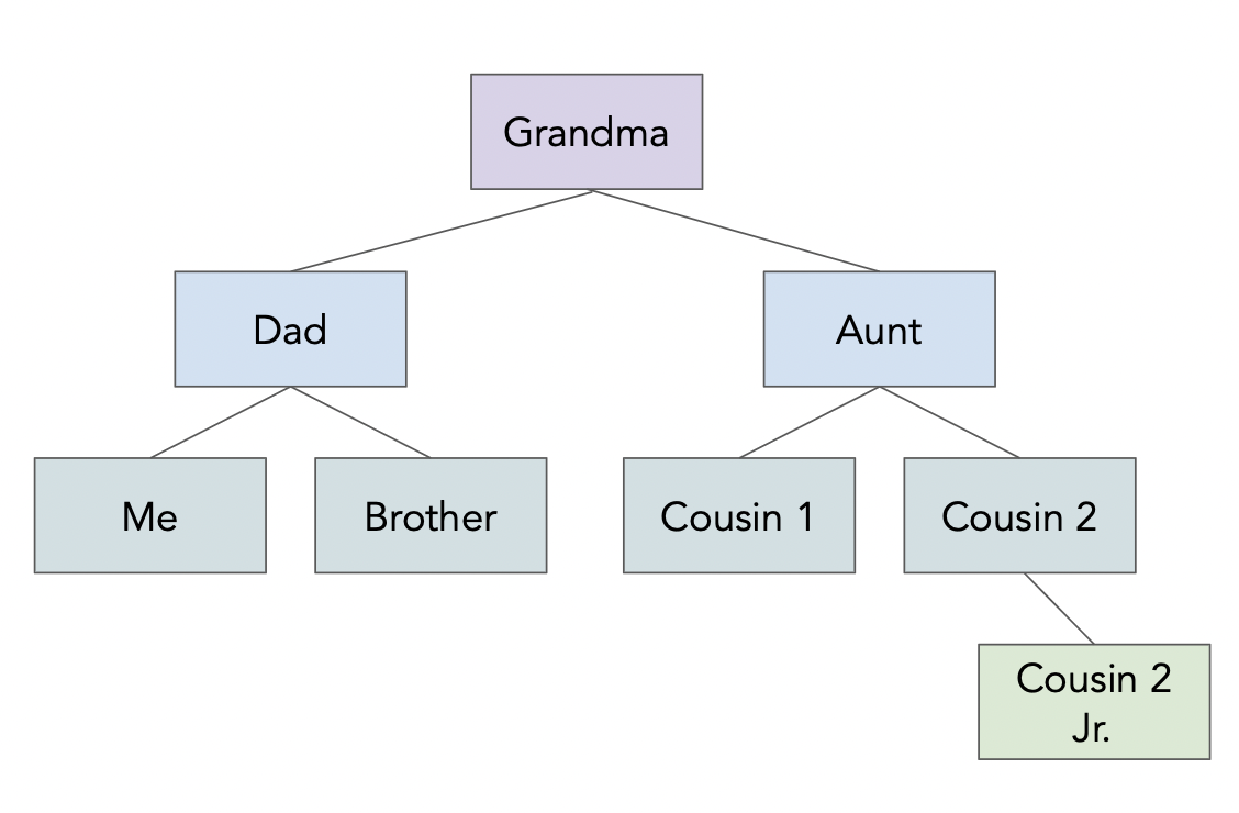
f = Path('data') / 'family.json'
family_tree = json.loads(f.read_text())
In [31]:
f.read_text()
Out[31]:
'{\n "name": "Grandma",\n "age": 94,\n "children": [\n {\n "name": "Dad",\n "age": 60,\n "children": [{"name": "Me", "age": 24}, \n {"name": "Brother", "age": 22}]\n },\n {\n "name": "My Aunt",\n "children": [{"name": "Cousin 1", "age": 34}, \n {"name": "Cousin 2", "age": 36, "children": \n [{"name": "Cousin 2 Jr.", "age": 2}]\n }\n ]\n }\n ]\n}'
In [ ]:
In [ ]:
f.read_text()
In [20]:
family_tree
Out[20]:
{'name': 'Grandma',
 'age': 94,
 'children': [{'name': 'Dad',
   'age': 60,
   'children': [{'name': 'Me', 'age': 24}, {'name': 'Brother', 'age': 22}]},
  {'name': 'My Aunt',
   'children': [{'name': 'Cousin 1', 'age': 34},
    {'name': 'Cousin 2',
     'age': 36,
     'children': [{'name': 'Cousin 2 Jr.', 'age': 2}]}]}]}
In [27]:
family_tree['children'][1]['children'][0]['age']
Out[27]:
34
In [ ]:
In [ ]:
In [ ]:
family_tree['children'][1]['children'][0]['age']
Aside: eval
eval, which stands for "evaluate", is a function built into Python.It takes in a string containing a Python expression and evaluates it in the current context.
In [28]:
x = 4
eval('x + 5')
Out[28]:
9
- It seems like
evalcan do the same thing thatjson.loadsdoes...
In [32]:
eval(f.read_text())
Out[32]:
{'name': 'Grandma',
 'age': 94,
 'children': [{'name': 'Dad',
   'age': 60,
   'children': [{'name': 'Me', 'age': 24}, {'name': 'Brother', 'age': 22}]},
  {'name': 'My Aunt',
   'children': [{'name': 'Cousin 1', 'age': 34},
    {'name': 'Cousin 2',
     'age': 36,
     'children': [{'name': 'Cousin 2 Jr.', 'age': 2}]}]}]}
- But you should almost never use
eval. The next slide demonstrates why.
eval gone wrong
Observe what happens when we use eval on a string representation of a JSON object:
In [35]:
f_other = Path('data') / 'evil_family.json'
eval(f_other.read_text())
---------------------------------------------------------------------------
ValueError                                Traceback (most recent call last)
Cell In[35], line 2
      1 f_other = Path('data') / 'evil_family.json'
----> 2 eval(f_other.read_text())

File <string>:6

Cell In[34], line 5, in err()
      4 def err():
----> 5     raise ValueError('i just deleted all your files lol 😂')

ValueError: i just deleted all your files lol 😂
Oh no! Since
evil_family.json, which could have been downloaded from the internet, contained malicious code, we now lost all of our files.This happened because
evalevaluates all parts of the input string as if it were Python code.You never need to do this – instead, use the
.json()method of a response object, or use thejsonlibrary.
Using the json module
Let's process the same file using the json module. Note:
json.load(f)loads a JSON file from a file object.json.loads(f)loads a JSON file from a string.
In [36]:
f_other = Path('data') / 'evil_family.json'
s = f_other.read_text()
s
Out[36]:
'{\n "name": "Grandma",\n "age": 94,\n "children": [\n {\n "name": err(),\n "age": 60,\n "children": [{"name": "Me", "age": 24}, \n {"name": "Brother", "age": 22}]\n },\n {\n "name": "My Aunt",\n "children": [{"name": "Cousin 1", "age": 34}, \n {"name": "Cousin 2", "age": 36, "children": \n [{"name": "Cousin 2 Jr.", "age": 2}]\n }\n ]\n }\n ]\n}'
In [37]:
json.loads(s)
---------------------------------------------------------------------------
JSONDecodeError                           Traceback (most recent call last)
Cell In[37], line 1
----> 1 json.loads(s)

File ~/miniconda3/envs/dsc80/lib/python3.12/json/__init__.py:346, in loads(s, cls, object_hook, parse_float, parse_int, parse_constant, object_pairs_hook, **kw)
    341     s = s.decode(detect_encoding(s), 'surrogatepass')
    343 if (cls is None and object_hook is None and
    344         parse_int is None and parse_float is None and
    345         parse_constant is None and object_pairs_hook is None and not kw):
--> 346     return _default_decoder.decode(s)
    347 if cls is None:
    348     cls = JSONDecoder

File ~/miniconda3/envs/dsc80/lib/python3.12/json/decoder.py:338, in JSONDecoder.decode(self, s, _w)
    333 def decode(self, s, _w=WHITESPACE.match):
    334     """Return the Python representation of ``s`` (a ``str`` instance
    335     containing a JSON document).
    336
    337     """
--> 338     obj, end = self.raw_decode(s, idx=_w(s, 0).end())
    339     end = _w(s, end).end()
    340     if end != len(s):

File ~/miniconda3/envs/dsc80/lib/python3.12/json/decoder.py:356, in JSONDecoder.raw_decode(self, s, idx)
    354     obj, end = self.scan_once(s, idx)
    355 except StopIteration as err:
--> 356     raise JSONDecodeError("Expecting value", s, err.value) from None
    357 return obj, end

JSONDecodeError: Expecting value: line 6 column 17 (char 84)
Since
util.err()is not a string in JSON (there are no quotes around it),json.loadsis not able to parse it as a JSON object.This "safety check" is intentional.
Handling unfamiliar data
Never trust data from an unfamiliar site.
Never use
evalon "raw" data that you didn't create!The JSON data format needs to be parsed, not evaluated as a dictionary.
- It was designed with safety in mind!
Aside: pd.read_json
pandas also has a built-in read_json function.
In [ ]:
pd.read_json(f)
It only makes sense to use it, though, when you have a JSON file that has some sort of tabular structure. Our family tree example does not.
Question 🤔 (Answer at dsc80.com/q)
Code: lec09-json
Use ChatGPT to give you examples of inputs to pd.read_json() where the JSON reads successfully and unsuccessfully. What do you learn about pd.read_json()?
APIs and scraping
Programmatic requests
We learned how to use the Python
requestspackage to exchange data via HTTP.GETrequests are used to request data from a server.POSTrequests are used to send data to a server.
There are two ways of collecting data through a request:
- By using a published API (application programming interface).
- By scraping a webpage to collect its HTML source code.
APIs
An application programming interface (API) is a service that makes data directly available to the user in a convenient fashion.
Advantages:
The data are usually clean, up-to-date, and ready to use.
The presence of a API signals that the data provider is okay with you using their data.
The data provider can plan and regulate data usage.
- Some APIs require you to create an API "key", which is like an account for using the API.
- APIs can also give you access to data that isn't publicly available on a webpage.
Big disadvantage: APIs don't always exist for the data you want!
API terminology
A URL, or uniform resource locator, describes the location of a website or resource.
An API endpoint is a URL of the data source that the user wants to make requests to.
For example, on the Reddit API:
- the
/commentsendpoint retrieves information about comments. - the
/hotendpoint retrieves data about posts labeled "hot" right now.
- To access these endpoints, you add the endpoint name to the base URL of the API.
- the
API requests
- API requests are just
GET/POSTrequests to a specially maintained URL. - Let's test out the Pokémon API.
First, let's make a GET request for 'squirtle'. To do this, we need to make a request to the correct URL.
In [38]:
def create_url(pokemon):
    return f'https://pokeapi.co/api/v2/pokemon/{pokemon}'

create_url('squirtle')
Out[38]:
'https://pokeapi.co/api/v2/pokemon/squirtle'
In [39]:
r = requests.get(create_url('squirtle'))
r
Out[39]:
<Response [200]>
Remember, the 200 status code is good! Let's take a look at the content:
In [40]:
r.content[:1000]
Out[40]:
b'{"abilities":[{"ability":{"name":"torrent","url":"https://pokeapi.co/api/v2/ability/67/"},"is_hidden":false,"slot":1},{"ability":{"name":"rain-dish","url":"https://pokeapi.co/api/v2/ability/44/"},"is_hidden":true,"slot":3}],"base_experience":63,"cries":{"latest":"https://raw.githubusercontent.com/PokeAPI/cries/main/cries/pokemon/latest/7.ogg","legacy":"https://raw.githubusercontent.com/PokeAPI/cries/main/cries/pokemon/legacy/7.ogg"},"forms":[{"name":"squirtle","url":"https://pokeapi.co/api/v2/pokemon-form/7/"}],"game_indices":[{"game_index":177,"version":{"name":"red","url":"https://pokeapi.co/api/v2/version/1/"}},{"game_index":177,"version":{"name":"blue","url":"https://pokeapi.co/api/v2/version/2/"}},{"game_index":177,"version":{"name":"yellow","url":"https://pokeapi.co/api/v2/version/3/"}},{"game_index":7,"version":{"name":"gold","url":"https://pokeapi.co/api/v2/version/4/"}},{"game_index":7,"version":{"name":"silver","url":"https://pokeapi.co/api/v2/version/5/"}},{"game_index":7,"v'
Looks like JSON. We can extract the JSON from this request with the json method (or by passing r.text to json.loads).
In [41]:
rr = r.json()
rr.keys()
Out[41]:
dict_keys(['abilities', 'base_experience', 'cries', 'forms', 'game_indices', 'height', 'held_items', 'id', 'is_default', 'location_area_encounters', 'moves', 'name', 'order', 'past_abilities', 'past_types', 'species', 'sprites', 'stats', 'types', 'weight'])
In [42]:
rr['weight']
Out[42]:
90
In [43]:
rr['abilities'][1]['ability']['name']
Out[43]:
'rain-dish'
Let's try a GET request for 'billy'.
In [44]:
r = requests.get(create_url('billy'))
r
Out[44]:
<Response [404]>
We receive a 404 error, since there is no Pokemon named 'billy'!
Scraping
Scraping is the act of programmatically "browsing" the web, downloading the source code (HTML) of pages that you're interested in extracting data from.
Big advantage: You can always do it! For example, Google scrapes webpages in order to make them searchable.
Disadvantages:
It is often difficult to parse and clean scraped data.
- Source code often includes a lot of content unrelated to the data you're trying to find (e.g. formatting, advertisements, other text).
Websites can change often, so scraping code can get outdated quickly.
Websites may not want you to scrape their data!
In general, we prefer APIs, but scraping is a useful skill to learn.
Example: Scraping the HDSI faculty page
To fully understand how to scrape, we need to understand how HTML documents are structured and how to extract information out of them.
But as a preview of what's to come next week, let's start by making a request to the HDSI Faculty page, https://datascience.ucsd.edu/faculty.
In [ ]:
import certifi
certifi.where()
In [ ]:
# Sometimes, the requests library gets weirdly strict about the HDSI webpage,
# so we'll skip its security checks using verify=False.
fac_response = requests.get('https://datascience.ucsd.edu/faculty/', verify=False)
fac_response
The response is a long HTML document.
In [ ]:
len(fac_response.text)
In [ ]:
print(fac_response.text[:1000])
Question 🤔 (Answer at dsc80.com/q)
Code: lec09-fac
Try asking ChatGPT to get the faculty names from this webpage by pasting the HTML of fac_response into the prompt. What happens? Can you figure out a way to get around this?
To parse HTML, we'll use the BeautifulSoup library.
In [ ]:
from bs4 import BeautifulSoup
soup = BeautifulSoup(fac_response.text)
Now, soup is a representation of the faculty page's HTML code that Python knows how to extract information from.
In [ ]:
# Magic that we'll learn how to create together next Tuesday.
divs = soup.find_all('div', class_='vc_grid-item')
names = [div.find('h4').text for div in divs]
titles = [div.find(class_='pendari_people_title').text for div in divs]

faculty = pd.DataFrame({
    'name': names,
    'title': titles,
})
faculty.head()
Now we have a DataFrame!
In [ ]:
faculty[faculty['title'].str.contains('Lecturer') | faculty['title'].str.contains('Teaching')]
What if we want to get faculty members' pictures?
In [ ]:
from IPython.display import Image, display

def show_picture(name):
    idx = faculty[faculty['name'].str.lower().str.contains(name.lower())].index[0]
    display(Image(url=divs[idx].find('img')['src'], width=200, height=200))
In [ ]:
show_picture('duncan')
Question 🤔 (Answer at dsc80.com/q)
Code: lec09-imgs
Write a prompt so that ChatGPT generates bs4 code to correctly pull out the img tags from the HDSI Faculty HTML.
p.s. We'll go into much more detail on this on Thursday!