Heading here
My First paragraph
My second paragraph
from dsc80_utils import *
Goal: Access information about HDSI faculty members from the HDSI Faculty page.
Let's start by making a GET request to the HDSI Faculty page and see what the resulting HTML looks like.
import requests
fac_response = requests.get('https://datascience.ucsd.edu/faculty/', verify=False)
fac_response
/Users/tauhidur/miniforge3/envs/dsc80/lib/python3.11/site-packages/urllib3/connectionpool.py:1099: InsecureRequestWarning: Unverified HTTPS request is being made to host 'datascience.ucsd.edu'. Adding certificate verification is strongly advised. See: https://urllib3.readthedocs.io/en/latest/advanced-usage.html#tls-warnings
  warnings.warn(
<Response [500]>
fac_text = fac_response.text
len(fac_text)
2431
print(fac_text[:1000])
<!DOCTYPE html>
<html dir='ltr'>
<head>
	<meta http-equiv="Content-Type" content="text/html; charset=UTF-8" />
	<meta name="viewport" content="width=device-width, initial-scale=1.0">
			<title>Database Error</title>
	<style type="text/css">
		html {
			background: #f1f1f1;
		}
		body {
			background: #fff;
			border: 1px solid #ccd0d4;
			color: #444;
			font-family: -apple-system, BlinkMacSystemFont, "Segoe UI", Roboto, Oxygen-Sans, Ubuntu, Cantarell, "Helvetica Neue", sans-serif;
			margin: 2em auto;
			padding: 1em 2em;
			max-width: 700px;
			-webkit-box-shadow: 0 1px 1px rgba(0, 0, 0, .04);
			box-shadow: 0 1px 1px rgba(0, 0, 0, .04);
		}
		h1 {
			border-bottom: 1px solid #dadada;
			clear: both;
			color: #666;
			font-size: 24px;
			margin: 30px 0 0 0;
			padding: 0;
			padding-bottom: 7px;
		}
		#error-page {
			margin-top: 50px;
		}
		#error-page p,
		#error-page .wp-die-message {
			font-size: 14px;
			line-height: 1.5;
			margin: 25px 0 20px;
		}
		#error-page code {
			fon
This is not super intuitive to read!
robots.txt file.robots.txt file in their root directory, which contains a policy that allows or disallows automatic access to their site.If you make too many requests:
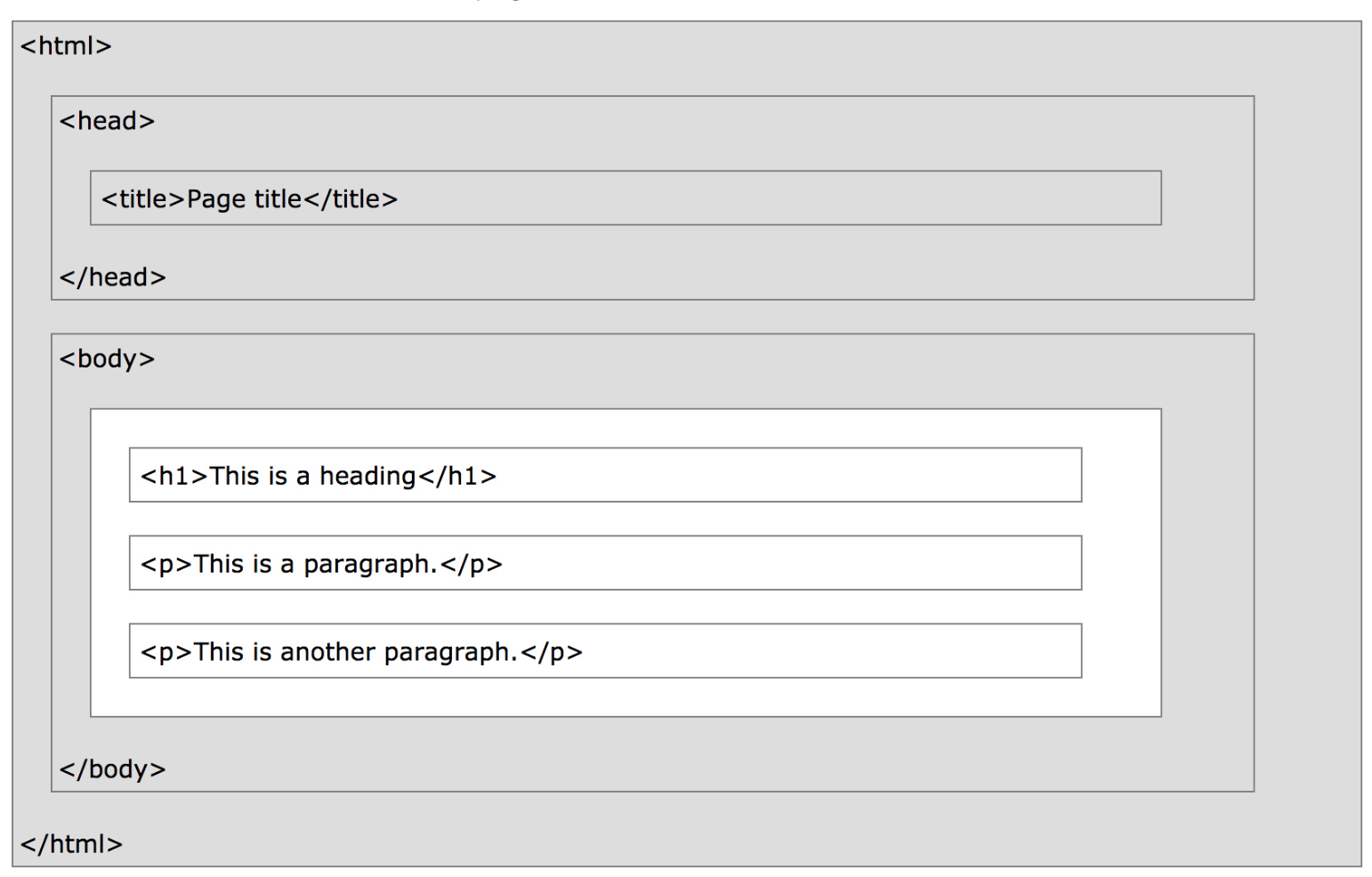
For instance, here's the content of a very basic webpage.
!cat data/lec10_ex1.html
<html>
  <head>
    <title>Page title</title>
  </head>

  <body>
    <h1>This is a heading</h1>
    <p>This is a paragraph.</p>
    <p>This is <b>another</b> paragraph.</p>
  </body>
</html>
Using IPython.display.HTML, we can render it directly in our notebook.
from IPython.display import HTML
HTML(filename=Path('data') / 'lec10_ex1.html')
This is a paragraph.
This is another paragraph.
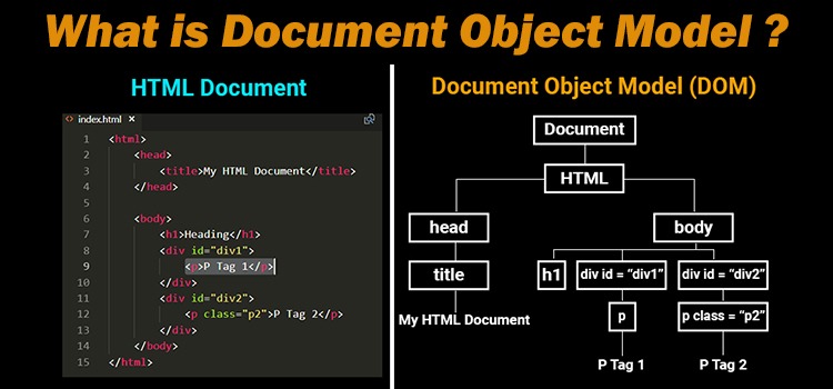
HTML document: The totality of markup that makes up a webpage.
Document Object Model (DOM): The internal representation of an HTML document as a hierarchical tree structure.
HTML element: An object in the DOM, such as a paragraph, header, or title.
HTML tags: Markers that denote the start and end of an element, such as <p> and </p>.
| Element | Description |
|---|---|
<html> |
the document |
<head> |
the header |
<body> |
the body |
<div> |
a logical division of the document |
<span> |
an inline logical division |
<p> |
a paragraph |
<a> |
an anchor (hyperlink) |
<h1>, <h2>, ... |
header(s) |
<img> |
an image |
There are many, many more, but these are by far the most common. See this article for examples.
Tags can have attributes, which further specify how to display information on a webpage.
For instance, <img> tags have src and alt attributes (among others):
<img src="king-selfie.png" alt="A photograph of King Triton." width=500>
Hyperlinks have href attributes:
Click <a href="https://practice.dsc80.com">this link</a> to access past exams.
What do you think this webpage looks like?
!cat data/lec10_ex2.html
<html>
  <head>
    <title>Project 4A and 4B - DSC 80, Spring 2024</title>
    <link
      href="https://cdn.jsdelivr.net/npm/bootstrap@5.3.0-alpha1/dist/css/bootstrap.min.css"
      rel="stylesheet"
    />
  </head>

  <body>
    <h1>Project Overview</h1>
    <img src="../imgs/platter.png" width="200" alt="My dinner last night." />
    <p>
      When the project is released, you can start it by
      <a href="https://github.com/dsc-courses/dsc80-2024-wi/"
        >public GitHub repo</a
      >.
    </p>
    <center>
      <h3>
        Note that you'll have to submit your notebook as a PDF and a link to
        your website.
      </h3>
    </center>
  </body>
</html>
<div> tag¶<div style="background-color:lightblue">
<h3>This is a heading</h3>
<p>This is a paragraph.</p>
</div>
The <div> tag defines a division or a "section" of an HTML document.
<div> as a "cell" in a Jupyter Notebook.The <div> element is often used as a container for other HTML elements to style them with CSS or to perform operations involving them using JavaScript.
<div> elements often have attributes, which are important when scraping!
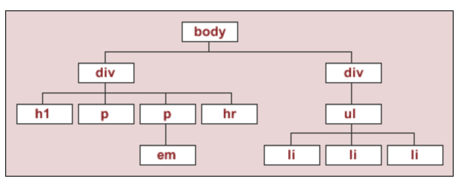
Under the document object model (DOM), HTML documents are trees. In DOM trees, child nodes are ordered.
What does the DOM tree look like for this document?

To start, we'll work with the source code for an HTML page with the DOM tree shown below:
The string html_string contains an HTML "document".
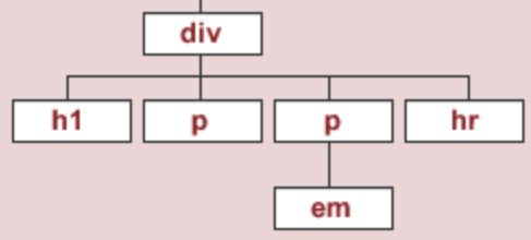
html_string = '''
<html>
    <body>
      <div id="content">
        <h1>Heading here</h1>
        <p>My First paragraph</p>
        <p>My <em>second</em> paragraph</p>
        <hr>
      </div>
      <div id="nav">
        <ul>
          <li>item 1</li>
          <li>item 2</li>
          <li>item 3</li>
        </ul>
      </div>
    </body>
</html>
'''.strip()
HTML(html_string)
My First paragraph
My second paragraph
BeautifulSoup objects¶bs4.BeautifulSoup takes in a string or file-like object representing HTML (markup) and returns a parsed document.
import bs4
bs4.BeautifulSoup?
Init signature:
bs4.BeautifulSoup(
    markup='',
    features=None,
    builder=None,
    parse_only=None,
    from_encoding=None,
    exclude_encodings=None,
    element_classes=None,
    **kwargs,
)
Docstring:
A data structure representing a parsed HTML or XML document.

Most of the methods you'll call on a BeautifulSoup object are inherited from
PageElement or Tag.

Internally, this class defines the basic interface called by the
tree builders when converting an HTML/XML document into a data
structure. The interface abstracts away the differences between
parsers. To write a new tree builder, you'll need to understand
these methods as a whole.

These methods will be called by the BeautifulSoup constructor:
  * reset()
  * feed(markup)

The tree builder may call these methods from its feed() implementation:
  * handle_starttag(name, attrs) # See note about return value
  * handle_endtag(name)
  * handle_data(data) # Appends to the current data node
  * endData(containerClass) # Ends the current data node

No matter how complicated the underlying parser is, you should be
able to build a tree using 'start tag' events, 'end tag' events,
'data' events, and "done with data" events.

If you encounter an empty-element tag (aka a self-closing tag,
like HTML's <br> tag), call handle_starttag and then
handle_endtag.
Init docstring:
Constructor.

:param markup: A string or a file-like object representing
 markup to be parsed.

:param features: Desirable features of the parser to be
 used. This may be the name of a specific parser ("lxml",
 "lxml-xml", "html.parser", or "html5lib") or it may be the
 type of markup to be used ("html", "html5", "xml"). It's
 recommended that you name a specific parser, so that
 Beautiful Soup gives you the same results across platforms
 and virtual environments.

:param builder: A TreeBuilder subclass to instantiate (or
 instance to use) instead of looking one up based on
 `features`. You only need to use this if you've implemented a
 custom TreeBuilder.

:param parse_only: A SoupStrainer. Only parts of the document
 matching the SoupStrainer will be considered. This is useful
 when parsing part of a document that would otherwise be too
 large to fit into memory.

:param from_encoding: A string indicating the encoding of the
 document to be parsed. Pass this in if Beautiful Soup is
 guessing wrongly about the document's encoding.

:param exclude_encodings: A list of strings indicating
 encodings known to be wrong. Pass this in if you don't know
 the document's encoding but you know Beautiful Soup's guess is
 wrong.

:param element_classes: A dictionary mapping BeautifulSoup
 classes like Tag and NavigableString, to other classes you'd
 like to be instantiated instead as the parse tree is
 built. This is useful for subclassing Tag or NavigableString
 to modify default behavior.

:param kwargs: For backwards compatibility purposes, the
 constructor accepts certain keyword arguments used in
 Beautiful Soup 3. None of these arguments do anything in
 Beautiful Soup 4; they will result in a warning and then be
 ignored.

 Apart from this, any keyword arguments passed into the
 BeautifulSoup constructor are propagated to the TreeBuilder
 constructor. This makes it possible to configure a
 TreeBuilder by passing in arguments, not just by saying which
 one to use.
File:           ~/miniforge3/envs/dsc80/lib/python3.11/site-packages/bs4/__init__.py
Type:           type
Subclasses:     BeautifulStoneSoup
Normally, we pass the result of a GET request to bs4.BeautifulSoup, but here we will pass our hand-crafted html_string.
soup = bs4.BeautifulSoup(html_string)
soup
<html>
<body>
<div id="content">
<h1>Heading here</h1>
<p>My First paragraph</p>
<p>My <em>second</em> paragraph</p>
<hr/>
</div>
<div id="nav">
<ul>
<li>item 1</li>
<li>item 2</li>
<li>item 3</li>
</ul>
</div>
</body>
</html>
type(soup)
bs4.BeautifulSoup
BeautifulSoup objects have several useful attributes, e.g. text:
print(soup.text)
Heading here
My First paragraph
My second paragraph


item 1
item 2
item 3
descendants¶The descendants attribute traverses a BeautifulSoup tree using depth-first traversal.
Why depth-first? Elements closer to one another on a page are more likely to be related than elements further away.
soup.descendants
<generator object Tag.descendants at 0x305bc1700>
for child in soup.descendants:
#     print(child) # What would happen if we ran this instead?
    if isinstance(child, str):
        continue
    print(child.name)
html
body
div
h1
p
p
em
hr
div
ul
li
li
li
Practically speaking, you will not use the descendants attribute (or the related children attribute) directly very often. Instead, you will use the following methods:
soup.find(tag), which finds the first instance of a tag (the first one on the page, i.e. the first one that DFS sees).soup.find(name=None, attrs={}, recursive=True, text=None, **kwargs).soup.find_all(tag) will find all instances of a tag.find finds tags!
soup.find('div')
<div id="content">
<h1>Heading here</h1>
<p>My First paragraph</p>
<p>My <em>second</em> paragraph</p>
<hr/>
</div>
Let's try and find the <div> element that has an id attribute equal to 'nav'.
soup.find('div', attrs={'id': 'nav'})
<div id="nav">
<ul>
<li>item 1</li>
<li>item 2</li>
<li>item 3</li>
</ul>
</div>
find will return the first occurrence of a tag, regardless of its depth in the tree.
# The ul child is not at the top of the tree, but we can still find it.
soup.find('ul')
<ul>
<li>item 1</li>
<li>item 2</li>
<li>item 3</li>
</ul>
find_all¶find_all returns a list of all matches.
soup.find_all('div')
[<div id="content">
 <h1>Heading here</h1>
 <p>My First paragraph</p>
 <p>My <em>second</em> paragraph</p>
 <hr/>
 </div>,
 <div id="nav">
 <ul>
 <li>item 1</li>
 <li>item 2</li>
 <li>item 3</li>
 </ul>
 </div>]
soup.find_all('li')
[<li>item 1</li>, <li>item 2</li>, <li>item 3</li>]
[x.text for x in soup.find_all('li')]
['item 1', 'item 2', 'item 3']
text attribute of a tag element gets the text between the opening and closing tags.attrs attribute of a tag element lists all of its attributes.get method of a tag element gets the value of an attribute.soup.find('p')
<p>My First paragraph</p>
soup.find('p').text
'My First paragraph'
soup.find('div')
<div id="content">
<h1>Heading here</h1>
<p>My First paragraph</p>
<p>My <em>second</em> paragraph</p>
<hr/>
</div>
soup.find('div').text
'\nHeading here\nMy First paragraph\nMy second paragraph\n\n'
soup.find('div').attrs
{'id': 'content'}
soup.find('div').get('id')
'content'
The get method must be called directly on the node that contains the attribute you're looking for.
soup
# While there are multiple 'id' attributes, none of them are in the <html> tag at the top.
soup.get('id')
soup.find('div').get('id')
'content'
Code: lec10-streams
Consider the following HTML document, which represents a webpage containing the top few songs with the most streams on Spotify today in Canada.
<head>
    <title>3*Canada-2022-06-04</title>
</head>
<body>
    <h1>Spotify Top 3 - Canada</h1>
    <table>
        <tr class='heading'>
            <th>Rank</th>
            <th>Artist(s)</th>
            <th>Song</th>
        </tr>
        <tr class=1>
            <td>1</td>
            <td>Harry Styles</td>
            <td>As It Was</td>
        </tr>
        <tr class=2>
            <td>2</td>
            <td>Jack Harlow</td>
            <td>First Class</td>
        </tr>
        <tr class=3>
            <td>3</td>
            <td>Kendrick Lamar</td>
            <td>N95</td>
        </tr>
    </table>
</body>
Part 1: How many leaf nodes are there in the DOM tree of the previous document — that is, how many nodes have no children?
Part 2: What does the following line of code evaluate to?
len(soup.find_all("td"))
Part 3: What does the following line of code evaluate to?
soup.find("tr").get("class")
Consider quotes.toscrape.com.
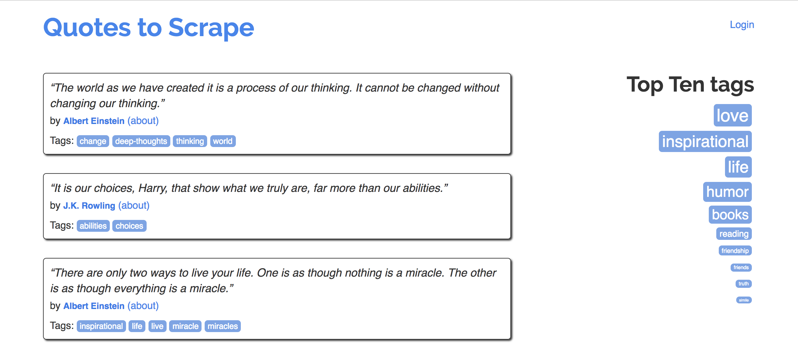
Goal: Extract quotes (and relevant metadata) into a DataFrame.
Specifically, let's try to make a DataFrame that looks like the one below:
| quote | author | author_url | tags | |
|---|---|---|---|---|
| 0 | “The world as we have created it is a process of our thinking. It cannot be changed without changing our thinking.” | Albert Einstein | https://quotes.toscrape.com/author/Albert-Einstein | change,deep-thoughts,thinking,world |
| 1 | “It is our choices, Harry, that show what we truly are, far more than our abilities.” | J.K. Rowling | https://quotes.toscrape.com/author/J-K-Rowling | abilities,choices |
| 2 | “There are only two ways to live your life. One is as though nothing is a miracle. The other is as though everything is a miracle.” | Albert Einstein | https://quotes.toscrape.com/author/Albert-Einstein | inspirational,life,live,miracle,miracles |
Code: lec10-quotes
Ask an LLM to write code to scrape the first ten pages of quotes from https://quotes.toscrape.com/ into a DataFrame called quotes_llm. The first three rows of quotes_llm should have the three quotes above. The last row of quotes_llm should contain a quote from George R.R. Martin.
After having an LLM write code, paste it below and see if it works. If it doesn't work, try to adjust your prompt until it does. Once you have something that works, submit your final prompt and generated code to http://dsc80.com/q.
Eventually, we will create a single function – make_quote_df – which takes in an integer n and returns a DataFrame with the quotes on the first n pages of quotes.toscrape.com.
To do this, we will define several helper functions:
download_page(i), which downloads a single page (page i) and returns a BeautifulSoup object of the response.
process_quote(div), which takes in a <div> tree corresponding to a single quote and returns a dictionary containing all of the relevant information for that quote.
process_page(divs), which takes in a list of <div> trees corresponding to a single page and returns a DataFrame containing all of the relevant information for all quotes on that page.
Key principle: some of our helper functions will make requests, and others will parse, but none will do both!
def download_page(i):
    req = requests.get(f"http://quotes.toscrape.com/page/{i}/")
    soup = bs4.BeautifulSoup(req.text)
    return soup
In make_quote_df, we will call download_page repeatedly – once for i=1, once for i=2, ..., i=n. For now, we will work with just page 1 (chosen arbitrarily).
soup = download_page(1)
soup
<!DOCTYPE html>

<html lang="en">
<head>
<meta charset="utf-8"/>
<title>Quotes to Scrape</title>
<link href="/static/bootstrap.min.css" rel="stylesheet"/>
<link href="/static/main.css" rel="stylesheet"/>
</head>
<body>
<div class="container">
<div class="row header-box">
<div class="col-md-8">
<h1>
<a href="/" style="text-decoration: none">Quotes to Scrape</a>
</h1>
</div>
<div class="col-md-4">
<p>
<a href="/login">Login</a>
</p>
</div>
</div>
<div class="row">
<div class="col-md-8">
<div class="quote" itemscope="" itemtype="http://schema.org/CreativeWork">
<span class="text" itemprop="text">“The world as we have created it is a process of our thinking. It cannot be changed without changing our thinking.”</span>
<span>by <small class="author" itemprop="author">Albert Einstein</small>
<a href="/author/Albert-Einstein">(about)</a>
</span>
<div class="tags">
            Tags:
            <meta class="keywords" content="change,deep-thoughts,thinking,world" itemprop="keywords"/>
<a class="tag" href="/tag/change/page/1/">change</a>
<a class="tag" href="/tag/deep-thoughts/page/1/">deep-thoughts</a>
<a class="tag" href="/tag/thinking/page/1/">thinking</a>
<a class="tag" href="/tag/world/page/1/">world</a>
</div>
</div>
<div class="quote" itemscope="" itemtype="http://schema.org/CreativeWork">
<span class="text" itemprop="text">“It is our choices, Harry, that show what we truly are, far more than our abilities.”</span>
<span>by <small class="author" itemprop="author">J.K. Rowling</small>
<a href="/author/J-K-Rowling">(about)</a>
</span>
<div class="tags">
            Tags:
            <meta class="keywords" content="abilities,choices" itemprop="keywords"/>
<a class="tag" href="/tag/abilities/page/1/">abilities</a>
<a class="tag" href="/tag/choices/page/1/">choices</a>
</div>
</div>
<div class="quote" itemscope="" itemtype="http://schema.org/CreativeWork">
<span class="text" itemprop="text">“There are only two ways to live your life. One is as though nothing is a miracle. The other is as though everything is a miracle.”</span>
<span>by <small class="author" itemprop="author">Albert Einstein</small>
<a href="/author/Albert-Einstein">(about)</a>
</span>
<div class="tags">
            Tags:
            <meta class="keywords" content="inspirational,life,live,miracle,miracles" itemprop="keywords"/>
<a class="tag" href="/tag/inspirational/page/1/">inspirational</a>
<a class="tag" href="/tag/life/page/1/">life</a>
<a class="tag" href="/tag/live/page/1/">live</a>
<a class="tag" href="/tag/miracle/page/1/">miracle</a>
<a class="tag" href="/tag/miracles/page/1/">miracles</a>
</div>
</div>
<div class="quote" itemscope="" itemtype="http://schema.org/CreativeWork">
<span class="text" itemprop="text">“The person, be it gentleman or lady, who has not pleasure in a good novel, must be intolerably stupid.”</span>
<span>by <small class="author" itemprop="author">Jane Austen</small>
<a href="/author/Jane-Austen">(about)</a>
</span>
<div class="tags">
            Tags:
            <meta class="keywords" content="aliteracy,books,classic,humor" itemprop="keywords"/>
<a class="tag" href="/tag/aliteracy/page/1/">aliteracy</a>
<a class="tag" href="/tag/books/page/1/">books</a>
<a class="tag" href="/tag/classic/page/1/">classic</a>
<a class="tag" href="/tag/humor/page/1/">humor</a>
</div>
</div>
<div class="quote" itemscope="" itemtype="http://schema.org/CreativeWork">
<span class="text" itemprop="text">“Imperfection is beauty, madness is genius and it's better to be absolutely ridiculous than absolutely boring.”</span>
<span>by <small class="author" itemprop="author">Marilyn Monroe</small>
<a href="/author/Marilyn-Monroe">(about)</a>
</span>
<div class="tags">
            Tags:
            <meta class="keywords" content="be-yourself,inspirational" itemprop="keywords"/>
<a class="tag" href="/tag/be-yourself/page/1/">be-yourself</a>
<a class="tag" href="/tag/inspirational/page/1/">inspirational</a>
</div>
</div>
<div class="quote" itemscope="" itemtype="http://schema.org/CreativeWork">
<span class="text" itemprop="text">“Try not to become a man of success. Rather become a man of value.”</span>
<span>by <small class="author" itemprop="author">Albert Einstein</small>
<a href="/author/Albert-Einstein">(about)</a>
</span>
<div class="tags">
            Tags:
            <meta class="keywords" content="adulthood,success,value" itemprop="keywords"/>
<a class="tag" href="/tag/adulthood/page/1/">adulthood</a>
<a class="tag" href="/tag/success/page/1/">success</a>
<a class="tag" href="/tag/value/page/1/">value</a>
</div>
</div>
<div class="quote" itemscope="" itemtype="http://schema.org/CreativeWork">
<span class="text" itemprop="text">“It is better to be hated for what you are than to be loved for what you are not.”</span>
<span>by <small class="author" itemprop="author">André Gide</small>
<a href="/author/Andre-Gide">(about)</a>
</span>
<div class="tags">
            Tags:
            <meta class="keywords" content="life,love" itemprop="keywords"/>
<a class="tag" href="/tag/life/page/1/">life</a>
<a class="tag" href="/tag/love/page/1/">love</a>
</div>
</div>
<div class="quote" itemscope="" itemtype="http://schema.org/CreativeWork">
<span class="text" itemprop="text">“I have not failed. I've just found 10,000 ways that won't work.”</span>
<span>by <small class="author" itemprop="author">Thomas A. Edison</small>
<a href="/author/Thomas-A-Edison">(about)</a>
</span>
<div class="tags">
            Tags:
            <meta class="keywords" content="edison,failure,inspirational,paraphrased" itemprop="keywords"/>
<a class="tag" href="/tag/edison/page/1/">edison</a>
<a class="tag" href="/tag/failure/page/1/">failure</a>
<a class="tag" href="/tag/inspirational/page/1/">inspirational</a>
<a class="tag" href="/tag/paraphrased/page/1/">paraphrased</a>
</div>
</div>
<div class="quote" itemscope="" itemtype="http://schema.org/CreativeWork">
<span class="text" itemprop="text">“A woman is like a tea bag; you never know how strong it is until it's in hot water.”</span>
<span>by <small class="author" itemprop="author">Eleanor Roosevelt</small>
<a href="/author/Eleanor-Roosevelt">(about)</a>
</span>
<div class="tags">
            Tags:
            <meta class="keywords" content="misattributed-eleanor-roosevelt" itemprop="keywords"/>
<a class="tag" href="/tag/misattributed-eleanor-roosevelt/page/1/">misattributed-eleanor-roosevelt</a>
</div>
</div>
<div class="quote" itemscope="" itemtype="http://schema.org/CreativeWork">
<span class="text" itemprop="text">“A day without sunshine is like, you know, night.”</span>
<span>by <small class="author" itemprop="author">Steve Martin</small>
<a href="/author/Steve-Martin">(about)</a>
</span>
<div class="tags">
            Tags:
            <meta class="keywords" content="humor,obvious,simile" itemprop="keywords"/>
<a class="tag" href="/tag/humor/page/1/">humor</a>
<a class="tag" href="/tag/obvious/page/1/">obvious</a>
<a class="tag" href="/tag/simile/page/1/">simile</a>
</div>
</div>
<nav>
<ul class="pager">
<li class="next">
<a href="/page/2/">Next <span aria-hidden="true">→</span></a>
</li>
</ul>
</nav>
</div>
<div class="col-md-4 tags-box">
<h2>Top Ten tags</h2>
<span class="tag-item">
<a class="tag" href="/tag/love/" style="font-size: 28px">love</a>
</span>
<span class="tag-item">
<a class="tag" href="/tag/inspirational/" style="font-size: 26px">inspirational</a>
</span>
<span class="tag-item">
<a class="tag" href="/tag/life/" style="font-size: 26px">life</a>
</span>
<span class="tag-item">
<a class="tag" href="/tag/humor/" style="font-size: 24px">humor</a>
</span>
<span class="tag-item">
<a class="tag" href="/tag/books/" style="font-size: 22px">books</a>
</span>
<span class="tag-item">
<a class="tag" href="/tag/reading/" style="font-size: 14px">reading</a>
</span>
<span class="tag-item">
<a class="tag" href="/tag/friendship/" style="font-size: 10px">friendship</a>
</span>
<span class="tag-item">
<a class="tag" href="/tag/friends/" style="font-size: 8px">friends</a>
</span>
<span class="tag-item">
<a class="tag" href="/tag/truth/" style="font-size: 8px">truth</a>
</span>
<span class="tag-item">
<a class="tag" href="/tag/simile/" style="font-size: 6px">simile</a>
</span>
</div>
</div>
</div>
<footer class="footer">
<div class="container">
<p class="text-muted">
                Quotes by: <a href="https://www.goodreads.com/quotes">GoodReads.com</a>
</p>
<p class="copyright">
                Made with <span class="zyte">❤</span> by <a class="zyte" href="https://www.zyte.com">Zyte</a>
</p>
</div>
</footer>
</body>
</html>
Let's look at the page's source code (right click the page and click "Inspect" in Chrome) to find where the quotes in the page are located.
divs = soup.find_all('div', attrs='quote')
From this <div>, we can extract the quote, author name, author's URL, and tags.
divs[3]
<div class="quote" itemscope="" itemtype="http://schema.org/CreativeWork">
<span class="text" itemprop="text">“The person, be it gentleman or lady, who has not pleasure in a good novel, must be intolerably stupid.”</span>
<span>by <small class="author" itemprop="author">Jane Austen</small>
<a href="/author/Jane-Austen">(about)</a>
</span>
<div class="tags">
            Tags:
            <meta class="keywords" content="aliteracy,books,classic,humor" itemprop="keywords"/>
<a class="tag" href="/tag/aliteracy/page/1/">aliteracy</a>
<a class="tag" href="/tag/books/page/1/">books</a>
<a class="tag" href="/tag/classic/page/1/">classic</a>
<a class="tag" href="/tag/humor/page/1/">humor</a>
</div>
</div>
# The quote.
divs[0].find('span').text
'“The world as we have created it is a process of our thinking. It cannot be changed without changing our thinking.”'
# The author.
divs[0].find('small', class_='author').text
'Albert Einstein'
# The URL for the author.
"http://quotes.toscrape.com" + divs[0].find('a').get('href')
'http://quotes.toscrape.com/author/Albert-Einstein'
# The quote's tags.
Let's implement our next function, process_quote, which takes in a <div> corresponding to a single quote and returns a dictionary containing the quote's information.
Why use a dictionary? Passing pd.DataFrame a list of dictionaries is an easy way to create a DataFrame.
def process_quote(div):
    quote = div.find('span', class_='text').text
    author = div.find('small', class_='author').text
    author_url = 'https://quotes.toscrape.com' + div.find('a').get('href')
    tags = div.find('meta', class_='keywords').get('content')

    return {'quote': quote, 'author': author, 'author_url': author_url, 'tags': tags}
process_quote(divs[-1])
{'quote': '“A day without sunshine is like, you know, night.”',
 'author': 'Steve Martin',
 'author_url': 'https://quotes.toscrape.com/author/Steve-Martin',
 'tags': 'humor,obvious,simile'}
Our last helper function will take in a list of <div>s, call process_quote on each <div> in the list, and return a DataFrame.
def process_page(divs):
    return pd.DataFrame([process_quote(div) for div in divs])
process_page(divs)
| quote | author | author_url | tags | |
|---|---|---|---|---|
| 0 | “The world as we have created it is a process ... | Albert Einstein | https://quotes.toscrape.com/author/Albert-Eins... | change,deep-thoughts,thinking,world |
| 1 | “It is our choices, Harry, that show what we t... | J.K. Rowling | https://quotes.toscrape.com/author/J-K-Rowling | abilities,choices |
| 2 | “There are only two ways to live your life. On... | Albert Einstein | https://quotes.toscrape.com/author/Albert-Eins... | inspirational,life,live,miracle,miracles |
| ... | ... | ... | ... | ... |
| 7 | “I have not failed. I've just found 10,000 way... | Thomas A. Edison | https://quotes.toscrape.com/author/Thomas-A-Ed... | edison,failure,inspirational,paraphrased |
| 8 | “A woman is like a tea bag; you never know how... | Eleanor Roosevelt | https://quotes.toscrape.com/author/Eleanor-Roo... | misattributed-eleanor-roosevelt |
| 9 | “A day without sunshine is like, you know, nig... | Steve Martin | https://quotes.toscrape.com/author/Steve-Martin | humor,obvious,simile |
10 rows × 4 columns
def make_quote_df(n):
    '''Returns a DataFrame containing the quotes on the first n pages of https://quotes.toscrape.com/.'''
    dfs = []
    for i in range(1, n+1):
        # Download page n and create a BeautifulSoup object.
        soup = download_page(i)

        # Create DataFrame using the information in that page.
        divs = soup.find_all('div', class_='quote')
        df = process_page(divs)

        # Append DataFrame to dfs.
        dfs.append(df)

    # Stitch all DataFrames together.
    return pd.concat(dfs).reset_index(drop=True)
quotes = make_quote_df(3)
quotes.head()
| quote | author | author_url | tags | |
|---|---|---|---|---|
| 0 | “The world as we have created it is a process ... | Albert Einstein | https://quotes.toscrape.com/author/Albert-Eins... | change,deep-thoughts,thinking,world |
| 1 | “It is our choices, Harry, that show what we t... | J.K. Rowling | https://quotes.toscrape.com/author/J-K-Rowling | abilities,choices |
| 2 | “There are only two ways to live your life. On... | Albert Einstein | https://quotes.toscrape.com/author/Albert-Eins... | inspirational,life,live,miracle,miracles |
| 3 | “The person, be it gentleman or lady, who has ... | Jane Austen | https://quotes.toscrape.com/author/Jane-Austen | aliteracy,books,classic,humor |
| 4 | “Imperfection is beauty, madness is genius and... | Marilyn Monroe | https://quotes.toscrape.com/author/Marilyn-Monroe | be-yourself,inspirational |
quotes[quotes['author'] == 'Albert Einstein']
| quote | author | author_url | tags | |
|---|---|---|---|---|
| 0 | “The world as we have created it is a process ... | Albert Einstein | https://quotes.toscrape.com/author/Albert-Eins... | change,deep-thoughts,thinking,world |
| 2 | “There are only two ways to live your life. On... | Albert Einstein | https://quotes.toscrape.com/author/Albert-Eins... | inspirational,life,live,miracle,miracles |
| 5 | “Try not to become a man of success. Rather be... | Albert Einstein | https://quotes.toscrape.com/author/Albert-Eins... | adulthood,success,value |
| 12 | “If you can't explain it to a six year old, yo... | Albert Einstein | https://quotes.toscrape.com/author/Albert-Eins... | simplicity,understand |
| 26 | “If you want your children to be intelligent, ... | Albert Einstein | https://quotes.toscrape.com/author/Albert-Eins... | children,fairy-tales |
| 28 | “Logic will get you from A to Z; imagination w... | Albert Einstein | https://quotes.toscrape.com/author/Albert-Eins... | imagination |
The elements in the 'tags' column are all strings, but they look like lists. This is not ideal, as we will see shortly.
Let's try and extract a list of HDSI Faculty from datascience.ucsd.edu/faculty.
fac_response = requests.get('https://datascience.ucsd.edu/faculty/', verify=False)
fac_response
soup = bs4.BeautifulSoup(fac_response.text)
It's not easy identifying which <div>s we want. The Inspect tool makes this easier, but it's good to verify that find_all is finding the right number of elements.
divs = soup.find_all(
    class_='vc_grid-item',
)
len(divs)
Within here, we need to extract each faculty member's name. It seems like names are stored as text within the <h4> tag.
divs[0]
divs[0].find('h4').text
We can also extract job titles:
divs[0].find(class_='field').text
Let's create a DataFrame consisting of names and job titles for each faculty member.
names = [div.find('h4').text for div in divs]
names[:10]
titles = [div.find(class_='field').text for div in divs]
titles[:10]
faculty = pd.DataFrame({
    'name': names,
    'title': titles,
})
faculty.head()
Now we have a DataFrame!
faculty[faculty['title'].str.contains('Teaching') | faculty['title'].str.contains('Lecturer')]
What if we want to get faculty members' pictures?
from IPython.display import Image, display

def show_picture(name):
    idx = faculty[faculty['name'].str.lower().str.contains(name.lower())].index[0]
    display(Image(url=divs[idx].find('img')['src'], width=200, height=200))

show_picture('marina')
Code: lec10-streams2
Consider the following HTML document, which represents a webpage containing the top few songs with the most streams on Spotify today in Canada.
<head>
    <title>3*Canada-2022-06-04</title>
</head>
<body>
    <h1>Spotify Top 3 - Canada</h1>
    <table>
        <tr class='heading'>
            <th>Rank</th>
            <th>Artist(s)</th>
            <th>Song</th>
        </tr>
        <tr class=1>
            <td>1</td>
            <td>Harry Styles</td>
            <td>As It Was</td>
        </tr>
        <tr class=2>
            <td>2</td>
            <td>Jack Harlow</td>
            <td>First Class</td>
        </tr>
        <tr class=3>
            <td>3</td>
            <td>Kendrick Lamar</td>
            <td>N95</td>
        </tr>
    </table>
</body>
Part 4: Complete the implementation of the function top_nth, which takes in a positive integer n and returns the name of the n-th ranked song in the HTML document. For instance, top_nth(2) should evaluate to "First Class" (n=1 corresponds to the top song).
Note: Your implementation should work in the case that the page contains more than 3 songs.
def top_nth(n):
    return soup.find("tr", attrs=__(a)__).find_all("td")__(b)__
soup.find and soup.find_all are the functions you will use most often.Regular expressions!